
An attractive and functional website can be a powerful tool for expanding your business, as it leaves a lasting impression on visitors and encourages them to take the necessary action. However, if you make any of the common web design blunders, your hard work will be undone in no time.
In order to avoid that, here are some common pitfalls to watch out for when you work on your website designs are mentioned below.
- Working Before Understanding Brand Preference
Many marketers make the fatal error of starting on their website’s design before they have compiled a complete collection of their brand’s assets.
If you don’t have a distinct brand design, it will be impossible to ensure that your website design accurately reflects your brand and is in sync with the rest of your marketing materials.
Your brand should encompass more than simply your logo. Additionally, it should also contain things like distinct typefaces, colours, symbols, graphics, and photographic styles.
If you want to create a website design experience that “talks” to people, you need to master the Kelowna website design thinking process. If you are unfamiliar with the term “design-thinking,” it refers to a method for determining what your customers want. It’s a way of thinking in which you empathize with customers, learn about their difficulties, and then design features to address those issues.
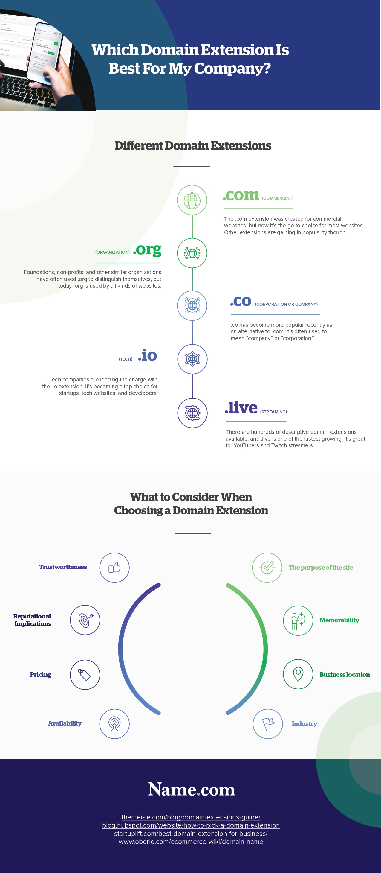
Infographic Created By Name.com, Easy To Use Domain Reseller Program
By adopting a design-thinking methodology, creative professionals may more easily define:
- their work’s purpose
- determine its scope
- develop the project’s business features
- learn about their customers’ needs
- comprehend the limitations of their technology
All of this information is useful for designers to put together preliminary sketches, sitemaps, and wireframes before diving into more complex design programs.
- Poor Navigation
If site visitors are forced to wade through unnecessary clutter caused by poor navigation, they will most likely leave.
If your site is poorly arranged, you risk having content hidden away or placed in the wrong section of the menu. Users may become frustrated if they are unable to access the information they require.
If you’re building a website with many different pages, organize them into hierarchical categories for easy navigation.
Moreover, not all devices have the same navigational controls. There are several approaches to navigation, but you must pick the one that best suits your needs.
- Poor Website Accessibility
There are various other ways to improve the accessibility of a website apart from just the navigation. However, this is typically ignored by designers when creating websites and user flows.
One of the most significant yet typical website design mistakes is ignoring millions of individuals worldwide who have trouble seeing during the design-thinking process.
Therefore, ensure you make the following features of a website easily accessible to visually-impaired people:
- Text size
- Colour contrasts
- Page titles
- Image alternate text
- Keyboard accessibility
- Lack of moving and blinking content like:
- Carousels
- Advertisements
- Autoplaying videos
Any Kelowna web design company considers these features and more to make its content more accessible. If done incorrectly, then the user experience and your company will suffer as a result.
- Cramming Too Much Content on a Single Page
Some websites make the error of cramming every available space with too much content, be it text or images. One of the most prevalent poor practices in website design that causes visitors to quit and return to search results is having too many elements on a page.
Create distinct web pages for various aspects of the website’s interface, such as the product catalogue, product details, user profiles, user activity, etc.
Next, break down the various parts of the web page’s interface into smaller, more manageable pieces. There needs to be a concentrated effort on the part of each of these elements to provide a single feature.
Further, assemble the website using these parts. With this method, you can ensure that your web pages will be developed quickly and scale easily.
- Unclear or Too Many CTAs
Web designers often fail by not making their call to actions (CTAs) obvious. In the world of business, a website serves as a kind of pipeline or funnel for advertising and sales. Within this funnel, visitors to your website make their way from being just prospects to fully converted customers.
Not converting many promising leads might be the result of a lack of obvious “calls to action” in strategic locations. Too many calls to action might also annoy potential customers. Therefore, you must have a precise and proper CTA for your website.
Conclusion
To make a good first impression, your company’s website should be as polished as possible. However, if you want to succeed in this area, you must steer clear of these common blunders in website development. If you are not professional in the field, consider taking help from a professional Web design Kelowna company to avoid these mistakes.
Focus on building a site that caters to your clients. Understanding your target market and catering to their needs will make website development much simpler.